Tuesday, November 4, 2014
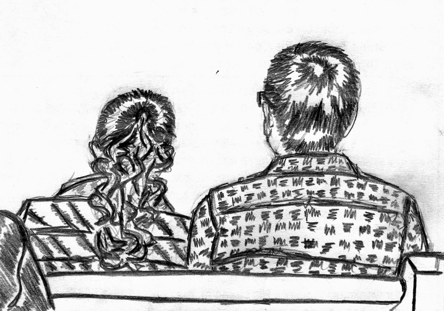
Clearly Contrast
Apparently I had an aversion to shading during this drawing. Everything is sharp and maximizing contrast. I like his hair and shirt and I feel like there was potential for cool things with her hair but I did not take advantage of it! Oh well.
Grace Bible Church (MI) On October 26, 2014
Bye Bye, Bic
I feel like I reached new levels of color-depth with graphite in this sketch. Maybe it was a new pencil...something fancier than Bic (sorry Bic). The rest of this sketch is just eh for me because I couldn't get the proportions of his head right.
UM GradCru Getaway (MI) on October 25, 2014
UM GradCru Getaway (MI) on October 25, 2014
Give Charcoal a Chance
Okay, so I didn't actually use charcoal for this drawing, but it came out extra graphite-rich and I like it. It was a quick sketch and sort of awkwardly positioned but I like the patterns in his Adidas shirt.
UM GradCru Getaway (MI) on October 25, 2014
Attack of the Photobombing Laptop
University of Michigan (MI) on October 24, 2014
The Dragon's High Top
Love her hair so much and I love the remnants of pencil that scatter around her high top. Kinda wish I finished the shading, but maybe the absence of shading makes other features pop...like her dragon-scaled scarf.
Grace Bible Church (MI) on October 19, 2014
Grace Bible Church (MI) on October 19, 2014
Monday, November 3, 2014
A Walk Down Memory Pew
Definitely not my favorite drawing but I was back in California so I can't hate it. Maybe adding more depth would make me like it better...or maybe not.
Calvary Church of Santa Ana (CA) on October 12, 2014
Calvary Church of Santa Ana (CA) on October 12, 2014
#ClassicGroupSelfie
So apart from the smudge, which is a result of taking so long to post these pictures, I like this one. So many different people in awkward perspectives. #classicgroupselfie
University of Michigan (MI) on October 7, 2014
University of Michigan (MI) on October 7, 2014
The Candy Striping Cartoon
Wish I had finished this one and either filled in the back or left the big section white. Also what's with this one looking real cartoon-like? I don't hate it.
University of Michigan (MI) on October 3, 2014
University of Michigan (MI) on October 3, 2014
Flickering Fingers
I feel like I never draw hands! Check out how these suckers just crept onto her arm. I accept. Sorry buddy on the right, you're not my favorite part of this sketch.
University of Michigan on September 26, 2014
University of Michigan on September 26, 2014
A Proportionate Partition
I like the random curves in the shirt, but the sections of shading that separate his hair are my favorite.
University of Michigan (MI) on September 26, 2014
University of Michigan (MI) on September 26, 2014
The Glossiest of Bobs
This is no exaggeration of how glossy her hair looked. I'm a tiny bit impressed that it came out so well.
University of Michigan (MI) on September 12, 2014
University of Michigan (MI) on September 12, 2014
Scaled and Wispy Fissures
Pretty sure this was just a regular braid, but it came out in scales. Scales with wispy fissures. I like it.
University of Michigan (MI) on September 12, 2014
University of Michigan (MI) on September 12, 2014
Subscribe to:
Comments (Atom)


